Google Analytics spatial data visualised with BigQuery and CARTO


Google Analytics is a staple component in most business intelligence team’s decision making processes. It provides insights about traffic sources to your website, tracks the success of your paid Ad campaigns and monitors the buyer’s purchasing behavior.
However, despite the wonderful insights you can glean using Google Analytics, the location data attached to each prospect’s activity is generally underutilised and hidden beneath dashboards and reports. The ‘out of the box’ geovisualisation (pictured below) offered in Google Analytics leaves much to be desired with only a single map of the geographic spread of your website visitors.

Together with our partner Data Runs Deep and their client, Red Balloon, we set out to explore more advanced methods of visualising Google Analytics data while also incorporating additional product location data to enhance the analysis. In this blog we will cover the tools we used and our data processing methods prior to visualising the data in CARTO.
Choosing the right tools for the job
The first phase of any project, be it large or small, is to evaluate the requirements, decide upon the right technology for the job and design a suitable solution. In this case, we were fortunate to have relatively loose output requirements meaning we could spend some time exploring our visualisation options.
The two fixed requirements were that we had to access data from Google Analytics and improve upon the visualisation provided through that platform.
The two key components of this task were a data warehouse and a visualisation tool.
- Google Cloud’s BigQuery was the data warehouse of choice, mostly for it’s rapid analytical ability on structured data and ease of integration with Google Analytics.
- For a visualisation tool, CARTO is our go-to for spatial analysis and visualisation. The added bonus was that CARTO integrates directly with BigQuery via a CARTO connector.

Getting the data ready
BigQuery is the key interlocker between Google Analytics and CARTO. If you’re using the standard Google Analytics platform, as we were, you’ll need to utilise the Google Analytics API to extract the website analytics information before ingesting it into BigQuery (special thanks to Ash from Data Runs Deep). If you’re a Google Analytics 360 user (Google’s advanced business analytics tool), your Google Analytics data is automatically ingested into BigQuery as a part of your subscription.
With the data extracted from Google Analytics, we had a range of source files to be pushed into BigQuery.
- For large source files, we created BigQuery tables by linking to a Google Drive Uniform Resource Identifier (URI) of the raw data file. Alternatively, we could have uploaded to a Google Cloud Storage bucket and imported into BigQuery from there.
Querying directly from the ‘linked’ table (from Google Drive in CSV format) in BigQuery was found to be slower, so we opted to query the table first, then save the results as a materialised view. This means the data is stored directly in BigQuery and is query optimised.
- For smaller source files, BigQuery tables were directly uploaded from the local drive.
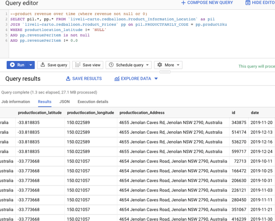
Once the data is organised in BigQuery, it is then ready for spatial analysis. Using CARTO’s Google BigQuery connector, it is simple to connect to data stored in BigQuery, run queries against it and then visualise, perform spatial analyses and build applications with it in CARTO. The connector enables CARTO to utilise the power of BigQuery’s petabyte scale analysis capability.

What can we achieve?
There are an abundance of insights you can glean using GA data in CARTO, however, depending on what questions your business is trying to solve will determine what your output looks like.
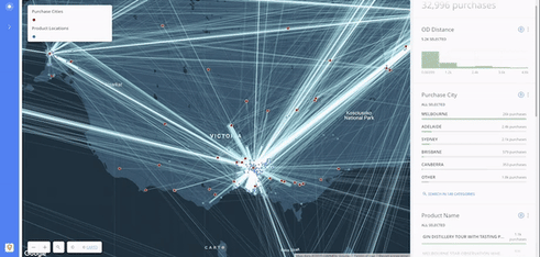
Here is one example of a CARTO map utilising data from Google Analytics via BigQuery. The map shows product and purchase locations with the ability to filter by a range of parameters.
Liveli hosted a webinar showing what is possible when you bring your Google Analytics data into CARTO.
The results shown in the webinar are beneficial to many industries including food delivery, retail, government and more. If you’re interested in seeing what the Google Analytics data looked like in CARTO – you can watch the webinar on the Liveli website.
Related Articles
Here are more related articles you may be interested in.
How Satellite based Earth Observation Supports Emergency Response Teams
Natural disasters are an increasingly familiar reality, yet their unpredictability remains a core challenge. This is why preparedness is our best means of mitigating impact when disaster does occur. Satellite technology plays a critical role in enabling this readiness, but why? To understand this, you need only consider the sheer scale and diversity of Australia’s landscapes, waters and ecosystems. The continent spans 7.7 million square kilometres and, relative to its total area, has a low population density. This…United Nations, Google Cloud and NGIS Team Up to Bring AI-Powered Planning to Communities in Crisis
The United Nations International Organization for Migration (IOM), in partnership with Google Cloud and NGIS are advancing data-driven humanitarian planning through the use of AI and Geospatial powered tools, helping humanitarian organisations to analyse the most vulnerable locations across multiple areas and proactively plan for disaster response, climate driven displacement, and long term community recovery. At the centre of the initiative is the…Celebrating Women in GIS: More than Maps
From tracking deforestation to building geospatial tools from the ground up, the women at NGIS are driving impactful real-world outcomes. This International Women’s Day, we spoke to three women across our Earth Observation, software engineering and spatial analysis solutions, to find out what first attracted them to GIS, what keeps them here, and what they’d tell their younger selves starting out.NGIS joins global space-based solutions provider CLS
Media Release | 27th January 2026 NGIS is excited to announce that the company will now be part of CLS (Collecte Localisation Satellites), a global leader in monitoring and surveillance solutions for our Earth. The acquisition marks a significant milestone for the Australian geospatial sector, bringing together NGIS’ world-class geospatial expertise with CLS Group’s expansive reach and innovative capabilities in space-based solutions. Beyond technology and commercial…